
Formatting Toolbar
Coming soon!
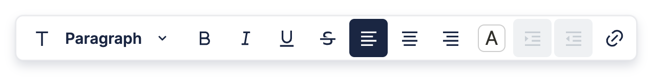
The Formatting Toolbar appears whenever you highlight text in the editor, and is mainly used for styling.
Custom Formatting Toolbar
You can create a custom Formatting Toolbar using a React component. This component should take the following props:
type CustomFormattingToolbarProps = {
  editor: BlockNoteEditor
};

const CustomFormattingToolbar = (props: CustomFormattingToolbarProps): JSX.Element => ...;
You can then tell BlockNote to use your custom Formatting Toolbar using the uiFactories option in useBlockNote, but you first have to turn it into a FormattingToolbarFactory. Fortunately, you can easily do this using the createReactFormattingToolbarFactory function:
const editor = useBlockNote({
  uiFactories: {
    formattingToolbarFactory: createReactFormattingToolbarFactory(
      CustomFormattingToolbar
    ),
  },
});
You can find out more about the uiFactories option in Creating Your Own UI Elements, but you don't need to worry about it if you're using BlockNote with React.
Default Items
It might seem daunting to create your own Formatting Toolbar from scratch, which is why BlockNote provides default React components for both the toolbar itself, and many items in the toolbar. Below are all the default components you can use to build your custom toolbar:
// Toolbar which wraps all the items.
const Toolbar = (props: {}) => ...;

// Dropdown which changes the block type.
type BlockTypeDropdownProps = {
  editor: BlockNoteEditor
};
const BlockTypeDropdown = (props: BlockTypeDropdownProps) => ...;

// Button which toggles a simple style on the highlighted text.
type ToggledStyleButtonProps = {
  editor: BlockNoteEditor;
  toggledStyle: "bold" | "italic" | "underline" | "strike" | "code";
};
const ToggledStyleButton = (props: ToggledStyleButtonProps) => ...;

// Button which sets the text alignment on the block.
type TextAlignButtonProps = {
  editor: BlockNoteEditor;
  textAlignment: "left" | "center" | "right" | "center";
};
const TextAlignButton = (props: TextAlignButtonProps) => ...;

// Button which opens a dropdown on hover. The dropdown lets you set the
// highlighted text's color.
type ColorStyleButtonProps = {
  editor: BlockNoteEditor
};
const ColorStyleButton = (props: ColorStyleButtonProps) => ...;

// Button which nests the block, if it can be nested.
type NestBlockButtonProps = {
  editor: BlockNoteEditor
};
const NestBlockButton = (props: NestBlockButtonProps) => ...;

// Button which unnests the block, if it can be nested.
type UnestBlockButtonProps = {
  editor: BlockNoteEditor
};
const UnestBlockButton = (props: UnestBlockButtonProps) => ...;

// Button which opens a dialog box to create a new link.
type CreateLinkButtonProps = {
  editor: BlockNoteEditor
};
const CreateLinkButton = (props: CreateLinkButtonProps) => ...;
Custom Items
You can also make your own toolbar items which match BlockNote's UI styling with the following React components:
// Custom dropdown.
type ToolbarDropdownProps = {
  // Array representing the items in the dropdown.
  items: Array<{
    // Item name/text.
    text: string;
    // Icon next to the text.
    icon?: IconType;
    // Function to execute on click.
    onClick?: (e: MouseEvent) => void;
    // Condition for when the item is selected/active.
    isSelected?: boolean;
    // Whether the item should be clickable.
    isDisabled?: boolean;
  }>;
  // Whether the dropdown should be clickable.
  isDisabled?: boolean;
};
const ToolbarDropdown = (props: ToolbarDropdownProps): JSX.Element => ...;

// Custom button.
type ToolbarButtonProps = {
  // Main tooltip, which is shown on hover.
  mainTooltip: string;
  // Secondary tooltip, usually showing the keyboard shortcut.
  secondaryTooltip?: string;
  // Icon for the button.
  icon?: IconType;
  // Function to execute on click.
  onClick?: (e: MouseEvent) => void;
  // Condition for when the item is selected/active.
  isSelected?: boolean;
  // Whether the item should be clickable.
  isDisabled?: boolean;
  // Child components, usually just the button text. If no children are
  // given, make sure to provide an icon.
  children?: any;
};
export const ToolbarButton = (props: ToolbarButtonProps) => ...;
Demo: Simple Custom Formatting Toolbar
The example below shows a basic custom formatting toolbar with four items. The first three are default items to toggle bold, italic, and underline, while the last one is a custom button which toggles the text and background colors to be blue.
If you're unsure about what's happening inside onClick and isSelected, head to Introduction to Blocks, which will guide you through manipulating blocks in the editor using code.